Love for comfortable interiors, light and happiness!

Love for comfortable interiors, light and happiness!

March 28, 2011

Love this Image!

Tea Leoni!

Isn't she just beautiful?  I have always admired her as an actress.  In this photo she has the perfect amount of make-up on.  Simple but nicely defined eyes and eyebrows, smooth skin (which I believe comes naturally to her and I am so jealous of).  Her lipstick is this gorgeous light shade of plumish/pink and works so well with her blonde hair.

Ok, time to completely confess as to why I really love this particular image of Tea.  I want her hair.  I know it appears to be a bit messy but I just love the casualness of it.  I want that look.  The casual (hair) yet completely pulled together (make-up) look for myself.  I see my fabulous hairstylist this Thursday.  I'm going blonde!!  Naturally I'm an awful mousey brown.  A cold brown, so just not flattering at all.  About 10 years ago (or so) I started going blonde and haven't wanted to back since.  I've been one who has multiple perms (back in the 70s and 80s) and have had my hair colored so often in many different ways (no purple / blue / or pink mind you) but I'm sure you get the drift.  

So wish me luck for Thursday!!  And?  I also love Tea Leoni's rings.  Double them up and get such a great impact.  :)

March 25, 2011

Veranda!

Notice the fireplace!

Then notice the fireplace again!!

Love the feature wall that is created with the soft yet dramatic wallpaper.  It doesn't distract you.  It just enhances the room in keeping with the subtle soft theme that has been chosen.

What I do miss however, are drapes on the beautiful windows.  A missed opportunity for coziness to add either a soft texture or soft color.

March 20, 2011

Harbinger Stool - Another One!

Rustic Stool

What I love about this stool is the plain rustic look.  It is so basic.  And there are many times in decorating or accessorizing where basic is much more appealing than poofed and frilly.

With the simple almost Amish stile weaved top this stool appears worn and livable.  One is not afraid of it.  Children will be allowed to play and sit on it without worries.  Or should I say worried by worried parents!


View from the top.  Just perfect.  

I guess that I am just drawn to these rustic stools because they have a nice utilitarian look to them.  Having something in your home that looks friendly is really necessary and puts guests of all ages at ease.

March 17, 2011

Harbinger Stools

Harbinger stools

Don't you just love these?  They have that wonderful rustic quality that makes them look as hand-me-downs.  And we all love hand-me-downs, you know those well worn, well loved pieces that show their age and how much they are loved by family.


Close up of the top of the stool with the nifty number 3 stenciled.  Also love the 4 bolts  that are smooth on top.  Gives it an industrial feel.

March 11, 2011

Suzanne Kasler

Foyer by Suzanne Kasler!

More aged gold with white and in this case a soft blue that is used sparingly.

You definitely do not want our Frank living in this home.  You see Frank is a hound/lab/mutt from our local Humane Society.  He is black.  Need I say more?

Love the door way with the pretty side lights.  They are wider than most and the low sloping arch above is very nice.  The light fixture has a lantern style and is so pretty.  And I recently noticed that the console table in the entry way is a half-sy!  

Pretty details in the aged gold almost aged brass really take this foyer from stark to soft and inviting!

March 09, 2011

Katie Ridder Wallpaper

Katie Ridder Wallpaper

So easy going and smart.  Not only do I enjoy the color palette used ( orange and blue with the yellow - fun and fresh ).

The water/waves are completely innovative.  I've not seen anything like them.  Very nicely done.  This adds to the fun and makes a typical sailboat on water unique!


Another wallpaper that is friendly and fresh.

These are not your typical flowers again Katie Ridder has taken a typical scene and changed it enough to be unique.  I love the simple way she dealt with the floral aspect and the use of 2 colors.

In my opinion the use of 2 colors allows the wallpaper pattern to stand out and makes it100% easier to decorate around.  You can add more pattern and color in the drapes, bedding, area rugs, pillows etc.

March 08, 2011

Gianfranco Ferre; Milan

Gianfranco Ferre

Love the simplicity of this style.  High neck and sleeveless.  But what ultimately caught my eye was the hemline.  So very flattering!


Same comments as above!

Wonderful style so simple and smart.  Fabrics are lovely and timeless.  My favorite has to be the one on the right.  I would love to have this and the model's beautiful platinum blonde do!

How about you?  :)

Both images borrowed from the lovely blog "This is Glamorous".

March 05, 2011

Janie Hirsch

Janie Hirsch Powder Room

At first glance you fall in love.  At second glance you notice all the gold and wonder.  At third glance ( which lasts much longer that 1st and 2nd ) you notice exactly why you fell in love!

White walls and the mirrors and the beautiful use of a soft dove gray give the gold a lovely back drop.  The use of the gold ( while it stands out ) is not overwhelming, it's darned pretty.  And I like Pretty.

Even the gold under mount sink ( which is nice and shiny ) has an allure to match the sink faucet.  The mirror over the sink has a lovely old world appeal and the light sconces seem to be the modern touch needed to balance.  I prefer balance to symmetry myself.  If you are wondering about the difference between the two stay tuned and I will go into that another time.  ( You may have to remind me though. )  ENJOY!!

Photo borrowed from My Notting Hill.

March 03, 2011

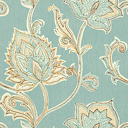
Thibault Wallpaper -- Again

This is so pretty.

It has an almost paisley pattern and of lately paisley has become my new favorite pattern.  I'm not really into blue shades however this light medium blue has an ethereal quality.  I tend to like dark navy when it comes to blues and the Robin's Egg blue is also something I am liking more and more.  Turquoise has always been a favorite.


Same pattern just a larger overall view.

Love the white outline of the pattern and the gold or wheat or camel hue thrown in.

When it comes to wallpaper I typically gravitate towards 2-tone or color.  I don't really care for an overdone color palate.  But I do love large classic patterns.  

The bigger the better.